** This post is a follow-up to Bob’s Postmortem **
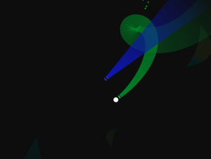
Line Renderer is awesome. Unity3D provides a built-in Line Renderer that billboards polylines based on given vertex positions. Ben and I had some experience using this to draw trials behind moving characters so we decided to play around with the component a bit more here. Using different widths and alpha values between the start and end vertices, and limiting the number of existing vertices, we generated wakes behind characters that were much more visually appealing than we expected.

I bring up our experience with the Line Renderer because it typifies much of our time working on this prototype. As Bob mentioned, working in the abstract space allowed us to create compelling mechanics and visuals at a relatively quick pace. Conversation Drawer certainly required quite a bit of work over the three weeks we devoted to it, but the rate at which we made visible progress consistently impressed me.
What am I looking at?
Essentially, Conversation Drawer asks the player to carry out conversations in a primarily visual space. The guides her avatar with the mouse cursor and attempts to engage with AI controlled characters in the roles of both follower and leader. When following, the player is tasked with touching ‘points’ that the leader is making and staying within the leaders trail wake to get a speed boost. Following in the leader’s wake allows the player to catch up quickly with a generous speed boost, but a certain number of points must be touched before the player can take the lead. When the player takes the lead, the roles reverse and the player attempts to guide the partner to her own points, eventually letting the partner take lead again. Each time a point is touched or a character takes the lead, both partners gain a small amount speed, as if the conversation is growing in enthusiasm. Failing to touch points our switch leaders eventually slows the interaction down and leads to a break in the conversation.
Complications
I don’t have much else to add to what Bob mentioned as the good stuff, so I’ll spend some time on what I didn’t go so hot. We had to bang our heads against problems springing from both technical complications and playability concerns, as well as some woes of abstract representation. Four problems stand out to me as the major issues, which were resolved to varying degrees.
Looping
Targeting the conceptual metaphor of conversation, made separating the game from a realistic, physical representation of space easy to justify, allowing us to make up the rules of our play space. To solve the problem of the player moving infinitely far away from the hub of AI characters to converse with, Ben implemented a looping system that keeps objects in the world within a given proximity. In the span of a few weeks, developing a spherical world did not seem especially achievable, so we opted to instead teleport objects between world boundaries. Making our space discontinuous for some objects introduced complications that weren’t very surprising, but nonetheless infuriating. Preventing objects from teleporting into or out of the player’s view was high priority, along with correctly transporting the characters’ trails without streaking them across the player’s screen, and ensuring that off-screen character trackers pointed in the correct direction.
Those First 30 Seconds
The first few players outside of ourselves completely missed the entry point to the game because we failed to compel them towards it. In a work like this, I’m personally keen on the idea of minimizing the amount of text, potentially to zero, that we display to the player, so introducing the ‘objective’ with a splash-screen or thick tutorial did not feel like the best option to me. Instead, I added a simple callout animation to the first AI character, in order to get the player’s attention and spark her curiosity. My hope was that player would see the animation, not know what else to do, click the animating object, and watch her unbeknownst avatar move towards the mouse … BAM, curiosity and discovery in the first 5 seconds. The callout even worked out as a nice visualization for AI characters interested in conversing.

Unfortunately the next 25 second were not as well handled. Some players understood that they were meant to follow their large partner, but others missed that completely and thought they were supposed to avoid or attack it. Bob mentioned in his postmortem that people come into games with trained assumptions, and I think the early playtests of this game reminded us that we need to be clear about which of these assumptions break down here, before they interrupt the player. A vaguely outer space-like setting with abstract shapes and one very specific bright, purple line, fulfilled some players’ frame of a space-shooter game. Even those players who knew to follow the partner did not understand how to progress beyond that and were surprised (not in a particularly good way) when they took the lead. If we move forward with this game, we will need to pay special attention to the very beginning of the game, so that we can build upon the early concepts. Players choosing to ignore our direction is far from a bad thing, but players having no idea how to read our directions is much more problematic.
Completing the Metaphor
Similar to our difficultly in communicating direction to the player, we are still struggling with making the gameplay feel like a conversation. The big piece we seem to be missing is facilitating a ‘back-and-forth’ between characters. We’ve made attempts but it does seem to be quite there. The concern is not that every player understand that we are trying to represent conversation, but rather that engaged players feel some sort of non-verbal communication happening between them and their partners, and don’t mistake the interaction as combat.
Following
At the moment the AI characters are little more than vehicles that fluctuate between seeking waypoints and seeking the player. When they hit one waypoint they change heading and move towards the next, sometimes making turns that are nearly impossible for the player to follow. Awkwardness was one of our experiential targets, so this is not always a problem, but the frequency of occurrence was far more than desired. Widening the leader’s wake as it extended made getting the follower’s speed boost easier from far behind, but staying inline while immediately behind the leader remained difficult, with minimal warning time and minimal space. We have yet to overcome this issue, but we are thinking about ways to reveal the leader’s upcoming turns and possibly switching to a Bezier curve path.
Final Thoughts
I like the direction this game headed in, and where it has potential to go. I think this game hits our core priorities and would work exceptionally well as a Master’s Capstone Project. Even with the confusion caused by some of our semiotics and pacing, many players noted that they enjoyed most of experience. If we build this game to completion, we will need to be constantly balancing between abstraction and readability.
