Amirelia – A Brief History

We’ve given some developer comments as we’ve released each of our levels with a sort of high level description, but today I’m going to go into a bit more detail as to the reasons behind creating each of our levels, as well as how they work together. I’ll be describing the levels slightly out of order, since our tutorial level actually acts as a simplified combination of each of the other levels. Be sure to also check out screenshots from our latest version on the Release gifs page!

**Fair warning, the following paragraphs contain spoilers about the content and puzzle solutions of Amirelia**

When developing levels and creating theories as to the experience that they are going to offer, it’s important to keep in mind that every player’s experience is going to be different, and these experiences will vary greatly from the one you had in mind. That being said, we started with a theme for each of our levels that we used as a starting point for designing layouts, interactions, aesthetics, and more. However, behind all of these themes was the original block that Amirelia was built on, the bond between the players. Perhaps more importantly, the bond’s representation of a connection between the players. Amirelia has always been about exploring and developing stronger connections, and giving players the opportunity to find new meaning in these connections. One other rule that we held ourselves to was to include absolutely no text outside of the menu system. This was a significant design challenge, but we found it to be quite rewarding for both us and the players when they would figure out solutions by bouncing ideas back and forth.

The first of the three main paths that we worked on is known as the Critical Path. Over the many phases of development, it was also referred to as Seasons and Harmony. Despite these name changes, the theme behind this level always remained the same; interaction between the players and the environment. We aimed to create a strong sense of connection between players and the physical area itself. In our earliest stages of development, Critical Path (then known as Seasons) included a puzzle where players had to pull two halves of a sphere apart in order to cause the massive “arms” of the level to rotate around into a position where players could access them. The sphere mechanic turned out to be confusing, but we felt that the players being able to physically change/rearrange the environment helped to develop a strong connection between them.
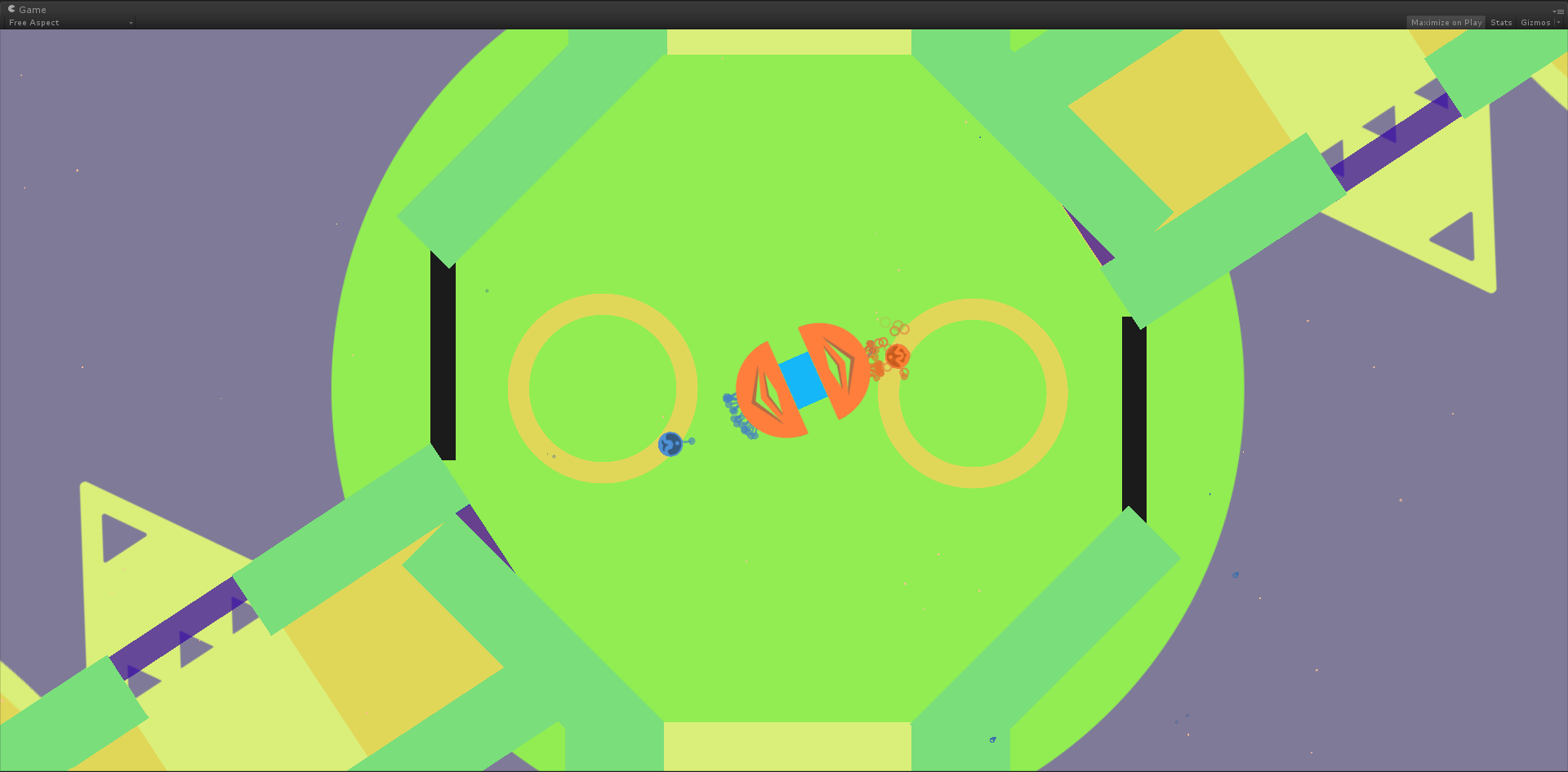
Old Seasons Level
After several design overhauls, we decided to include a stream that would both guide the players as well as prevent them from moving too far ahead in the game without solving certain puzzles. The stream was not specific to just Critical Path, but I mention it because it allowed us to create another connection between the players and the environment with stream-based mechanics. One such mechanic was the stream orb. Stream orbs are tiny spheres that the players can push around and that contain some of the stream within them. Similar to moving/rotating parts of the level itself, the stream orbs also offer an interaction that is very physical in its nature. When the players move these stream orbs to the orb receivers, it causes a strong visible change in the environment itself, further reinforcing the player-environment connection.
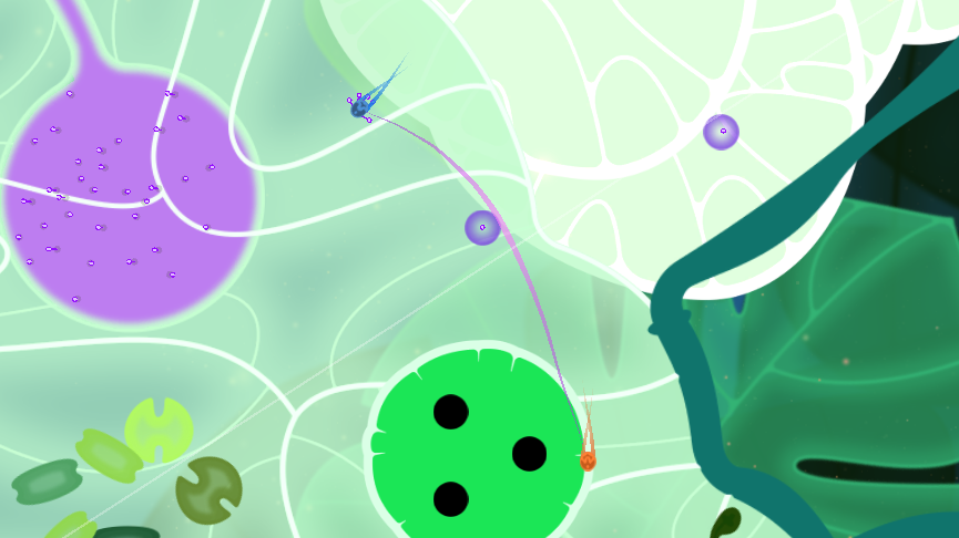
Critical Path Level
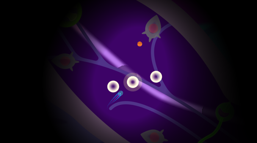
So now that we had a connection between the players and the environment, we needed a different connection for the other paths. Naturally, we immediately began to focus on the connection between the players. This led to the development of our Intimacy level, which encourages players to work closely together in both a physical and psychological sense. Early stages of Intimacy had players moving through confined areas, rarely any larger than a hallway. This did cause players to remain close, but left little room for puzzles or other interactions. Prior to the development of the stream orbs, this level had players moving a group of light orbs down these hallways. The goal of the orbs mechanic in this case was to encourage players to wrap them up in their bond, thereby keeping the players working closely together. We also included a sort of “wind tunnel” mechanic that would push the orbs backwards in certain areas if the players weren’t pulling them with the bond. As with the original Critical Path development, the theme was there but the confines and mechanics caused it to feel a bit clunky. Eventually, during one of our many brainstorming sessions, we decided to focus on the light-based mechanics in order to encourage players to stay close without the physical confinements. This brought us to our present form of Intimacy, where players have quite a bit of room to move around but are highly encourage to stay close together in order to see where they are going.
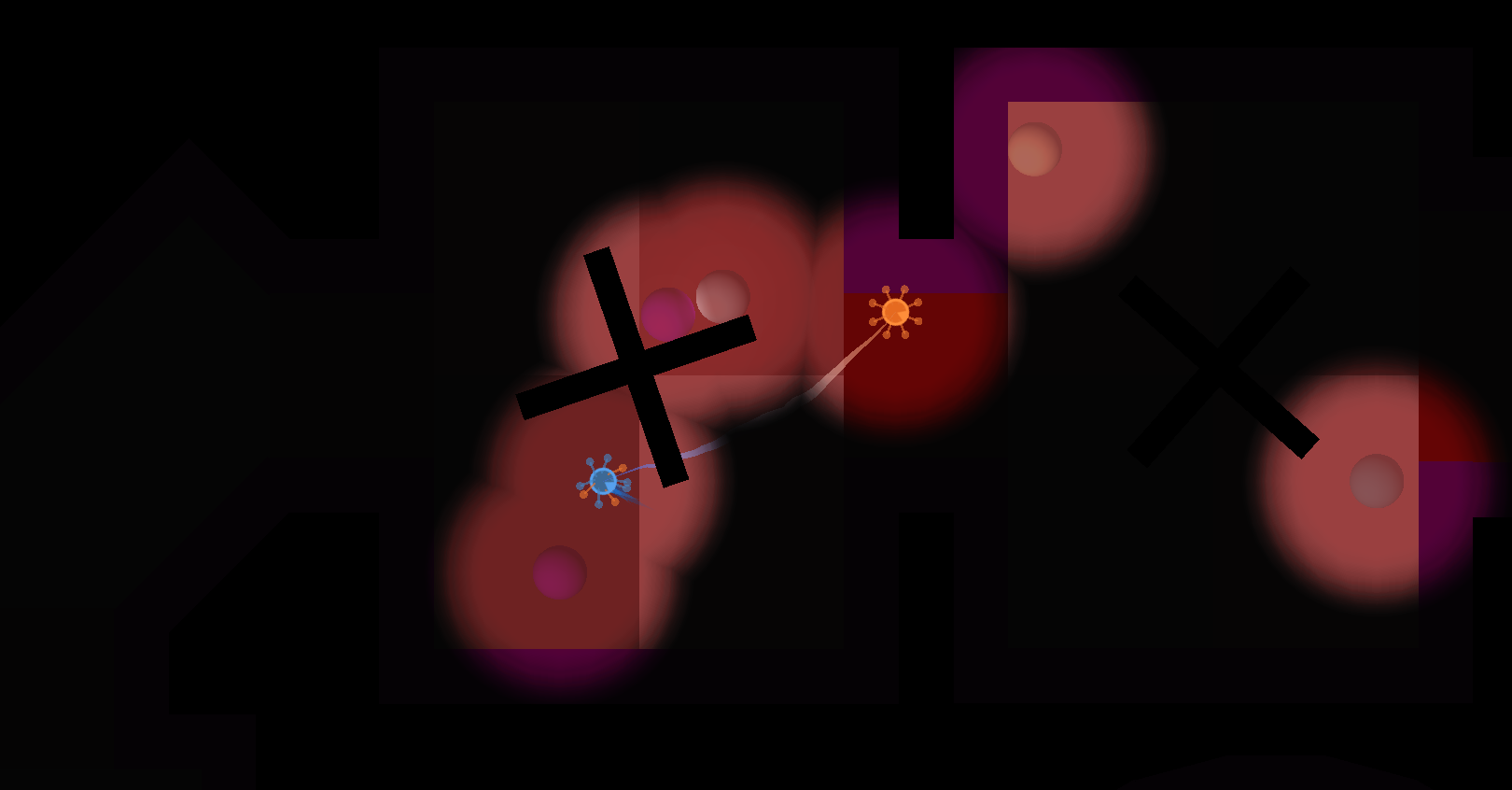
Old Intimacy Level
New Intimacy Level
We felt quite confident in the themes we had chosen for the first two paths, but we also knew that we wanted to have more than two possible ways to go. We considered a number of more abstract connections, and even built some intermediary areas between the levels where players could express artistic freedom through mechanics such as a canvas that players could paint by simply moving around on it. However, given that the players had been solving a series of puzzles prior to reaching these areas, we found that players often thought these canvases were also a puzzle that needed to be solved before moving on. This tended to lead to confusion when they made some attempts to solve it but couldn’t find a conclusive end. Eventually, we took a look at Intimacy and decided to try developing a level around the opposite type of connection. In this case, that meant a theme focused on distance between players. This left us with a significant design challenge because it was still very important to us that the players work together.
Old Expressive Area
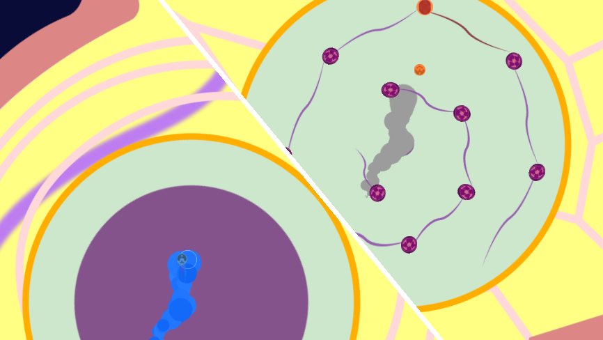
Early iterations of what became known as Asymmetry had players working with mirroring-based mechanics, where players were moved into two separate rooms. As one player would move around in their room, their movement was mirrored in the form of a circle moving around on the floor in the room of the second player. The player controlling the floor circle could see a sort of solution to the puzzle in their room, but couldn’t interact with the puzzle elements. The idea was that they would use the floor circle to help inform the other player, who could interact with the puzzle but didn’t know the solution, as to what they should be doing. As with our other early mechanics, players had difficulty understanding how this puzzle operated. In later iterations of Asymmetry we polished this mechanic by making two primary changes. The first change was to have the floor circle simply copy the one player’s movement instead of mirroring it. This allowed players to pick up on the basic mechanic idea much faster. Secondly, we carried over some of the concepts from our original painting canvases by having the copying effect only occur within the canvas area, as well as having the copying effect leave behind a fading paint trail. The canvas helped players identify that this was a significant area with a new mechanic, and the fading trail indicated movement, helping to highlight the copying mechanic. We included nodes in these puzzles as well, so that the copied player reveals the nodes and the other player needs to touch each of them. In this way, both players still rely on one another and share a sort of turn-based dependence on each other even though they are physically separated.
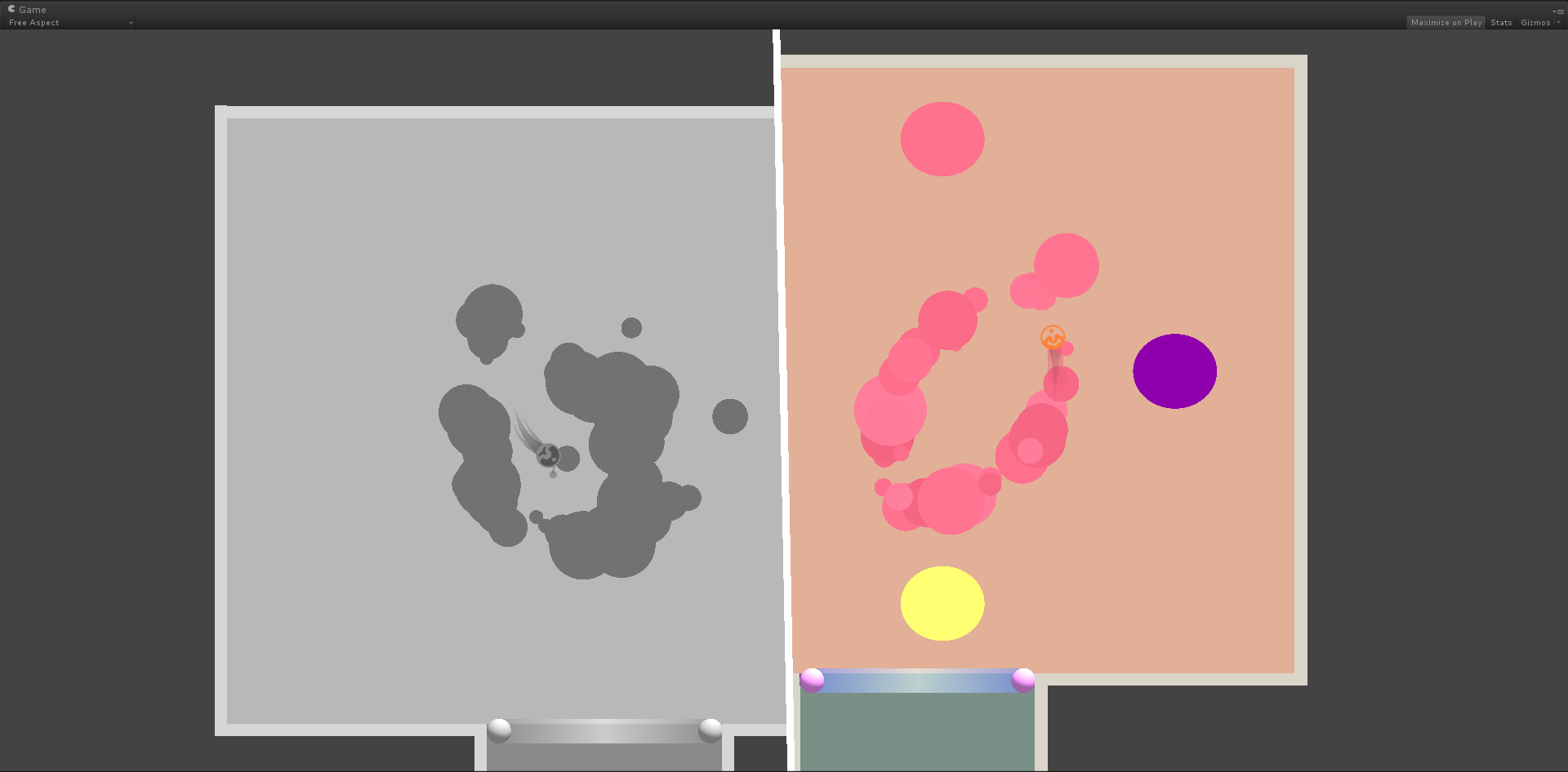
Old Asymmetry Level
New Asymmetry Level
The tutorial level may have been the first level we began developing, but I’m describing it last here because it serves to prepare the players for any of the other paths they may choose, and therefore includes a simplified version of many of the mechanics that I previously mentioned. Our tutorial has seen many iterations and drastic overhauls throughout the development process. It was essential to us that we get the tutorial to feel very smooth and intuitive for players in order to give them a sense of how to progress through the rest of the game. Throwing players into an abstract environment with no instructions caused us to develop other methods of motivating players towards specific behaviors. One example of this is the very first puzzle, where players need to work together to spin a flexible bar in order to escape the starting area. The first way of keeping this puzzle simple was to limit the number of possible solutions. We partially accomplished this by enclosing the puzzle in a pod that is opened as the players spin the pad. Closing in this area prevented players from considering a wider number of possible objects in the environment that could be involved in the solution. In addition to limiting possible solutions, we also encourage the players through background hints. On the pad that the players start on are two swirls, one blue and one orange (the player’s colors), that are meant to act as pointers towards where the players should move. We’ve considered highlighting these swirls or giving them a short animation to further encourage movement, but through testing we found that most players had a relatively easy time with the current version. As a final hint, the bars on the pad start off in a bent position in the direction that they should be pushed. As the players begin to solve the puzzle, they are immediately given a sign of progress as the pod that they are closed in begins to open.
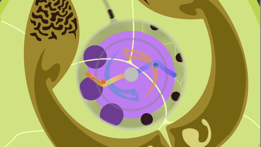
New Tutorial Level
This sort of simple, player-paced approach to puzzle design is how we developed all of the tutorial level. Players are introduced to mechanics one at a time, and these mechanics build on one another as the players progress. In the first puzzle that I mentioned, as well as a later tutorial puzzle where the players move an island, players are interacting with the environment and starting to form a connection. Just prior to being introduced to the bond mechanic, players move closer and closer together as they open pairs of gates. In order to create the initial bond, players physically connect with each other and the entire world changes in appearance. Towards the end of the tutorial, players are separated as they push a block with the bond to clear a path for the stream. Through these puzzles and interactions, we introduce the players to all of the themes that I described earlier.

Despite my long-winded explanations, I have only briefly touched the surface of all of the design, redesign, and theorizing that went into developing each and every version of the levels in our game. I strongly encourage any readers to reach out to any of the developers with any questions. We actually thoroughly enjoy talking about the work that we do. If you’re currently designing or thinking about designing some puzzles or levels, I hope I’ve offered a few words of wisdom to consider during the process.
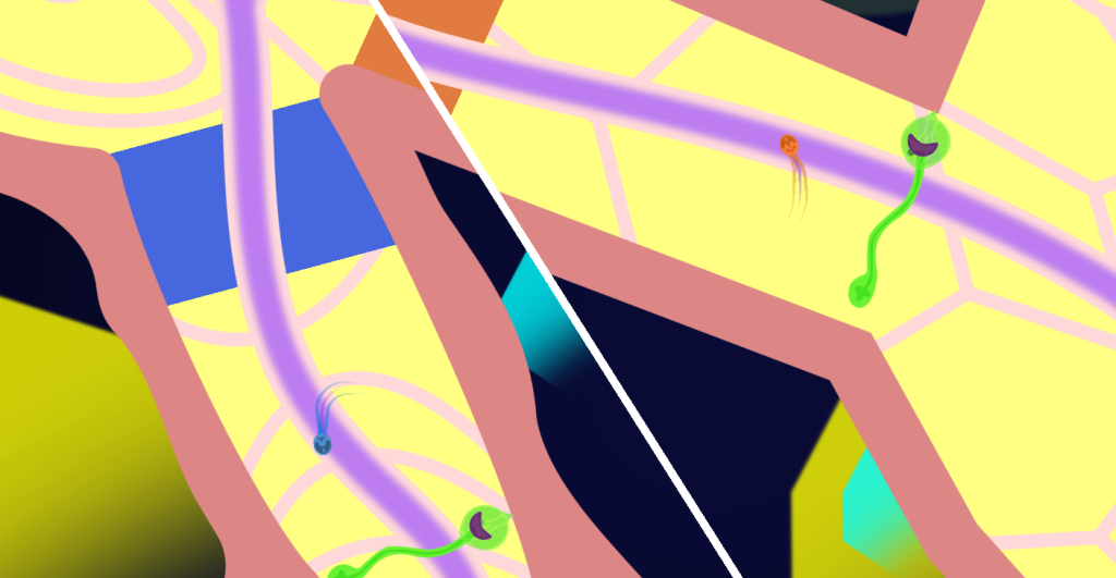
Fall Update

Hey there,

A lot has happened since Summer and we continue to make progress on Amirelia. A couple of notable events: firstly we took Amirelia to Playcrafting NYC’s Fall Expo in October at Microsoft’s offices in Manhattan. The response to the game was overwhelmingly positive and it is a pleasure to see new people interact with the demo. We will certainly be more active in letting everyone know when and where they can play the latest build going forward. Secondly, we completed our submission to the Independent Games Festival! We look forward to hearing the results in the coming months.

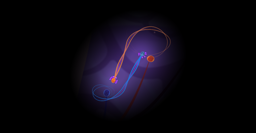
Since August the levels Intimacy and Asymmetry have come a long way in their development. The overall progression of the levels have been established and their basic art assets have been implemented. We still need to devote time to carefully playtest and refine them so they are as streamlined as our Tutorial. We aim to add additional layers of visual polish and audio feedback to enhance the environmental narrative of the game.

AsymmetryUpdate

IntimacyUpdate

Two of our core team members are moving cities this month and so our team becomes even more distributed, but we remain on track to finish development by the end of the year. We have a lot of work to do, but we are excited to put the finishing touches on the game! We will keep you posted.

All the best,

Studio FriendCannon

Kickstarter Launch!

We’re excited to announce that our Kickstarter campaign has officially launched! You can find the campaign page here. We’ve already received funding from over 20 backers, and we’re so grateful for the generosity of our friends, family, and the entire community. We’ll be posting more updates about the campaign here as we go, so keep an eye out for more news soon!

Demo Build Update!

We updated the demo build on our website! Play it here. If your browser is unable to load the game, please try another browser or the downloadable version linked on that page. Recent changes to Chrome do not play nicely with the Unity Player, and we have not yet been able to make a WebGL build. Major updates in this new version are listing below.


New Level after Tutorial

After the acquiring the bond, at the end of the tutorial, players now exit the level into a new area. This new area is visually and auditorily distinct from the tutorial, and it features puzzles that teach players fundamental uses of the bond. Both this new level and the tutorial are still being iterated upon based on playtests, but they are nearing completion. This will likely be the last level available in the free demo of the game.


Parallax:

Perspective cameras are now used to show depth between the players and the background. The level that the players move around within is kept at a depth very close to the players, but the background elements are positioned far behind so that they appear to move relative to the camera a vastly different rate. This change means that we know need to pay much closer attention to the depths of objects than we did when using orthographic cameras. After the switch the major work was flattening the parts of the scene that should not appear to parallax relative to the players.


Move to Unity 5:

 We’ve been wanting to upgrade to Unity 5 for a couple months now, so transitioning to the MAGIC Lab seemed like the perfect time to upgrade the project and move forward with all the neat new features. Unfortunately, we had not anticipated that the move to PhysX 3.3 would essentially break our primary mechanic! The updated joint physics caused the bond, and all objects that used similar code, to behave erratically when attempting to wrap around something in the world. After tweaking a couple numbers, changing some code, and surviving more than few headaches, we were able to restore the bond’s proper behavior.

Moving into RIT’s MAGIC center!

Greetings friends, families and subscribers. This is Arun bringing you this week’s update from Amirelia and the team.

This week was pretty eventful. Started with a hectic Monday, when the team scrambled about, polishing the game for its IndieCade submission. Having successfully done that, we’ve then been settling in at the MAGIC lab at RIT. But before we’re ready to resume work from where we left it off, there were a few other things we needed to take care of:

Unity 5

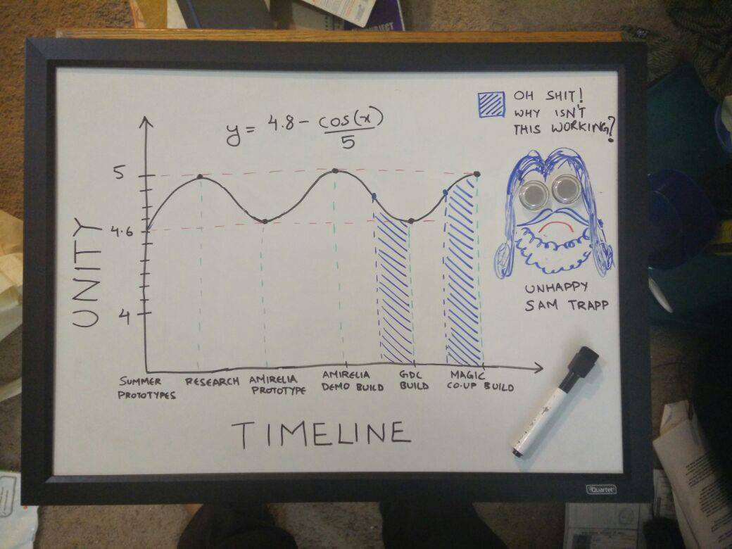
Over its lifetime, Amirelia has switched back and forth between Unity 4.6 and 5, several times. We’re moving back to Unity 5 once (again) and for all. Why, you ask? For lack of a better reason, I took the liberty to justify this action using a colourful graph and some bogus math:

Amirelia Unity Graph

In reality, though, in the past, RIT was generous enough to give us Unity 5 Pro Beta access while we were working on it as our capstone project. However, lack of webplayer in Unity 5’s Beta at that time, caused us to move back to 4.6 for our GDC demo. Now that Unity 5 has released and is fully supported, we decided to move back to it and feel this’ll be a better alternative in the long run. Thus, this week, Sam and Ben have been working on the non-trivial task of migrating the project to Unity 5.

Kicking It Off

Bryan and Bob have been researching successful Kickstarter campaigns to help us plan our own. We had a few ideas using which Bob will be storyboarding a first draft for our promotional video. You can read more about in our previous blog post.

Intimate Shading

I’ve been working on a potential shader for the Intimacy levels. The goals of the level itself will be described in a future post when Bob’s Intimacy level reaches a finer level of polish. But I can give a brief description of the shader in the meantime.

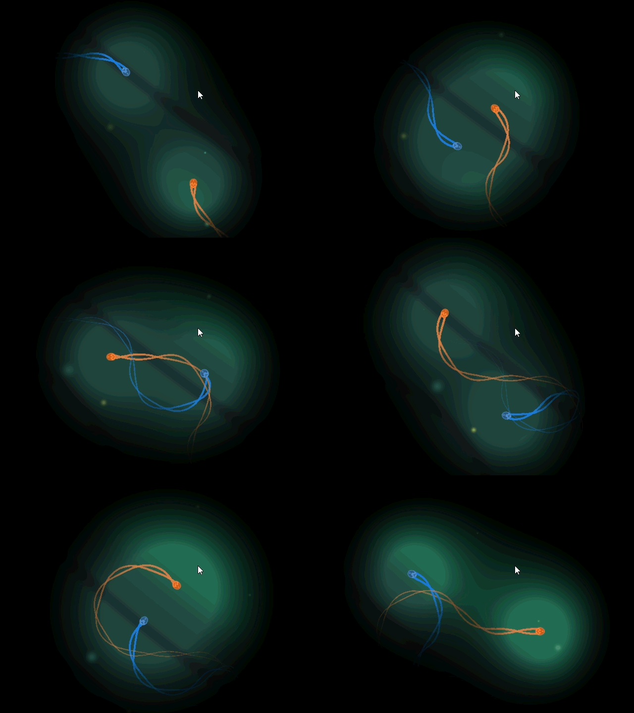
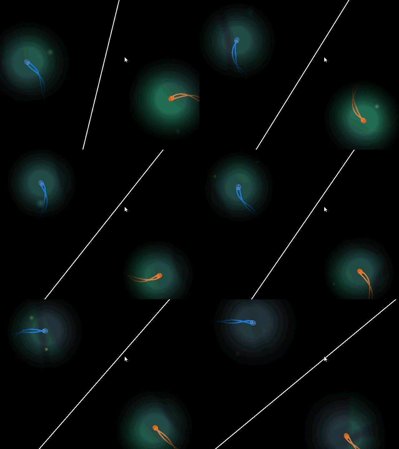
The shader’s primary goal is to limit players’ visibility radius as they separate, incentivising intimacy and closeness in this space. We tried to create this effect using Unity lighting, but even with all light removed, it wasn’t dark enough. So after a lot of thought, Sam and I decided we should work with transparencies instead of lighting.

So we created a large black sheet that covers everything around the characters. We started with a simple stencil shader, but didn’t like the uniform look it gave us. We wanted a smooth gradient along this visibility, something that mimics a light source. Then after multiple iterations, I arrived at this:

intimacy_together    intimacy_separated_2

                         Players Together                                                          Players Separated

Original plan was to make the shader behave similar to having a spotlight follow each character. But, because of how blending works, it caused the overlapping areas to be darker, as opposed to brighter. Thus, I could not use two sheets following the players and instead had to merge all the math into one entity instead. This led to some very interesting, metaball like results. We were happy with its organic look and feel, so we kept it.

For the smooth gradient effect (which isn’t prominently visible in the gifs), I used math identical to Light Attenuation or Fall Off. I found a (not so dense) Source Engine article and followed their strategy of exposing Constant, Linear and Quadratic coefficients (for anyone interested, the link will be down at the bottom). This gives us a good amount of control over the shader, allowing us to tweak how narrow, wide and bright their vision circles should be. I also threw in some noise into the equation to give it a radial pulsing an effect.

Additionally, this effect favours being closer, as proximity increases the characters’ circle of vision. I look forward to seeing it fully implemented with Bob’s level.

Signing off,

Arun


References:

Source Engine Attenuation

Updates & Future Work

Many events have been going on recently, including our capstone presentation of Amirelia, our graduation, and our submission to the IndieCade Festival. Furthermore, we have recently begun working as part of RIT’s Co-op Start-up program that will allow us to continue working on Amirelia and hopefully release an early access version around mid August.

For the early access release, we would ideally like to have four levels for the players to experience. Once we’ve achieved that goal, we’d like to create more levels and release a full version later in the year. However, the program we’re working with at RIT ends in August, and so we’ll need some funding in order to be able to finish the game. So, with great anticipation, we’d like to announce that we’ll be launching a Kickstarter campaign! We intend to have this campaign up and running by mid June with a duration of about 15-20 days. We’re excited to continue our work, and we hope that we will receive enough support to achieve our goals.

As for our website, look for a new video and screenshots in the next few days! We’ll be updating the blog more often too, especially as we get closer to the Kickstarter launch.

Build Update!

In preparation for Imagine RIT and RPI Gamefest tomorrow, we’ve updated the build that can be found on the Play page. The current demo concludes at the end of the tutorial level. For those of you that have played the previous build that we had uploaded before GDC, you will notice that it looks almost like a completely different game. We’ve made many significant changes to most every aspect of the game, including mechanics, visual aesthetic, and audio. If you get a chance to play it, we would greatly appreciate any feedback that you are willing to provide. Feedback can be posted on this blog, the Play page comments section, or sent to amireliagame@gmail.com. We look forward to hearing from you!

Upcoming Events

With May approaching quickly, we’re making great strides to have a presentable demo up and running before that time. Our current plan is for the demo to end at the end of the tutorial, with the remainder of the game being saved for an eventual release. There are a number of deadlines that surround the beginning of May, and so you can expect to see an updated build on the Play page by then.

That being said, we’re excited to announce that we’ll be taking Amirelia to RPI Gamesfest! Also, just in case our schedule wasn’t packed enough, we’re splitting our team up for that weekend so that we can also present at Imagine RIT! It’s going to be an exciting weekend, and we hope to get some great feedback from our playtesters.

We’ll be making some more announcements as May approaches, so keep an eye out for more news from us in the near future!

April Update

We’ve been sorting through a mountain of design decisions in the past few weeks, and the current state of Amirelia reflects that. However, we still have many decisions left to make. Things are mostly functional in the new tutorial at this point, and so we’re taking a close look at our visual aesthetics. In general, we’re developing an organic aesthetic and giving the players the sense of restoring an organic habitat by working together. The growing friendship between the players is then symbolized by the growing life that surrounds the players.

We’re also going to be working on consistency, especially in regards to aesthetics. When the new version of the tutorial is uploaded, it should be considerably more consistent than our current online version. We have many goals that we hope to achieve by the time May arrives, and we will do our best to post updates as time provides.

Post GDC

We’re back from the Game Developer’s Conference, and we’re now working on implementing a number of significant changes to the core functions of Amirelia based on the feedback we received from playtesters. We’re currently re-examining the purpose of Amirelia, and we intend to use subtractive design to remove any components of the game that do not enhance the purpose. Once we’ve trimmed away the extraneous components, we’ll get to work on adding new features that have been designed with this purpose in mind. Expect to see a very different experience on the Play page in a few weeks!