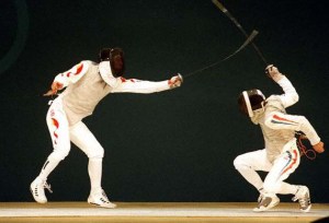
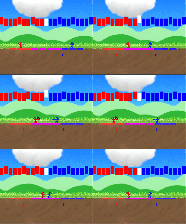
For this week’s prototype we worked in a split-team group consisting of Bob, Sam, and myself. As Bob mentioned before, it’s a fencing game where you move in sync with the beat of the music, and can easily be viewed as a mash-up of Nidhogg and Crypt of the Necrodancer. We originally called it Rhythm Fencer but then changed it to Sword Dancing. The naming convention may appear inconsistent at times, but those names are referring to the same game.
What went right:
Personally I felt this prototype was an overall success. Simply put, this prototype generally seemed to achieve the experience that I was hoping to convey. The challenge of staying in rhythm while also attempting to compete in a series of quick, rock-paper-scissors style battles combined for an engaging experience.

What needed work:
Though the controls were simple, players did feel a bit confused by the combat mechanics. We had a splash screen before the game begins that explains the mechanics, but it was a bit cluttered and somewhat difficult to understand. Players pointed out that this could be made simpler by displaying just one character’s controls instead of both, and by showing just one character winning at each of the three possible ways. Displaying only one character would reduce the amount of possible clutter, and then we could simply show both sets of controls under the one character.
Another bit of feedback we received was that players interpreted the animation for missing a beat as an animation that meant that they got hit. This was clarified on the splash screen, but we would still like to find a way to make the meaning more intuitive.
Finally, the movement of the rectangles that showed the approaching beat was hard to follow. It was set up this way originally in hopes of representing a crowd in the background that was doing the wave to show the approaching beats. However, with a fast song this quickly became very difficult to follow, and instead players simply focused on the white rectangle in the middle in order to stay on beat. We felt that this could be fixed by hiding the rectangles that aren’t representing the beat. In other words, this would change it from looking like a crowd of rectangles to looking like a single rectangle that is slowly moving towards the middle.
Conclusion:
Although this post focuses on what could be improved, I’d just like to state again that I felt this prototype turned out to be a success. The core mechanics seemed to be generally understood, and the controls were simple enough that brand new players could participate in a somewhat competent manner. Not to get too far into details, but from a cognitive load perspective this has been our most easily understood prototype. I will take the suggestions and feedback from this game, as well as our other prototypes, and use them to improve the level of understanding of our future work.
– Bryan
Image Source:
http://www.thearma.org/essays/LSvMF/agrs5.jpg
